Kitsuné UI
A design system for building beautiful, consistent user interfaces.

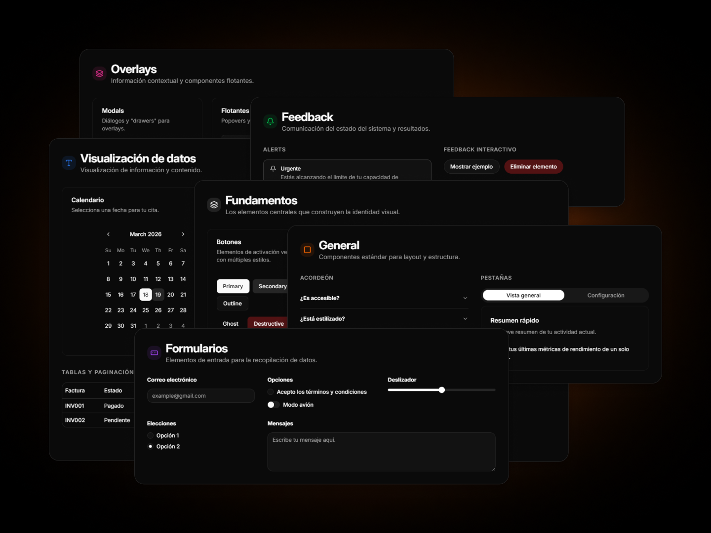
A high-performance, accessible, and production-ready component library built to scale digital products at startup speed.
The "Why"
When I joined Growth in 2023, we faced a scaling challenge: we needed to ship high-quality MVPs and internal tools for dozens of different clients, each with their own requirements but requiring the same level of UI excellence.
I proposed and spearheaded the creation of Kitsuné. The goal was to build a single source of truth that allowed us to jump from Figma to a functional, accessible product in record time. It was my way of ensuring that being a "team of one" didn't mean sacrificing engineering standards.
The "Build vs. Buy" Decision: Why not shadcn/ui?
While I am a huge admirer of shadcn/ui, Kitsuné was born out of specific strategic necessity:
- Total Adaptability: By building our own primitives on top of Radix UI, I ensured we had 100% control over the component API, allowing for highly specific custom behaviors that "off-the-shelf" solutions often make difficult to implement.
- Architectural Sovereignty: Kitsuné allowed us to swap visual styles across 30+ different projects without touching the underlying business logic or accessibility features.
- Shape-shifting Nature: Like the mythical fox it's named after, the library was designed to adapt its form to any client's brand identity while maintaining a consistent, high-quality "soul."
Technical Showcase (Exhibition Version)
Notice: Due to Non-Disclosure Agreements (NDAs) and the proprietary nature of my work at Growth, I cannot distribute the full library source code.
This repository and the live demo serve as a Functional Exhibition. I have recreated the core logic and visual patterns to demonstrate:
- Compound Component Patterns: High-level abstractions for complex UIs.
- A11y Excellence: Full keyboard navigation and ARIA compliance.
- Design Tokens: A robust system for theming and consistency.
Tech Stack
- Framework: Next.js / React
- Styling: Tailwind CSS + CVA (Class Variance Authority)
- Primitives: Radix UI
- Animation: Framer Motion
- Quality: Storybook / Lucide Icons
Impact & Lessons
Building and maintaining Kitsuné taught me that a Design System is 20% code and 80% communication. It forced me to think about Semantic Versioning, documentation, and how to build software that my "future self" wouldn't hate when a client asked for a change six months later.