BACK TO ARCHIVE
Nagare
A SaaS landing page focused on structure, content and visual hierarchy.
nagare.preview
2025 × HTML, CSS, JavaScript
Nagare is a landing page concept for an operations SaaS. The product itself is fictional; the project focuses on how a page can introduce a product, explain what it does and answer the questions a potential user might have along the way.
The page was inspired by a similar landing page I worked on at Growth, but rebuilt from scratch with a different visual direction.
//Starting with the problem
A landing page usually has a lot to explain in a relatively small space.
What is the product? Who is it for? What does it actually do? How does it work? How much does it cost?
I wanted these questions to appear naturally throughout the page instead of presenting all the information at once. Each section has a specific purpose and introduces the next piece of information when it becomes relevant.
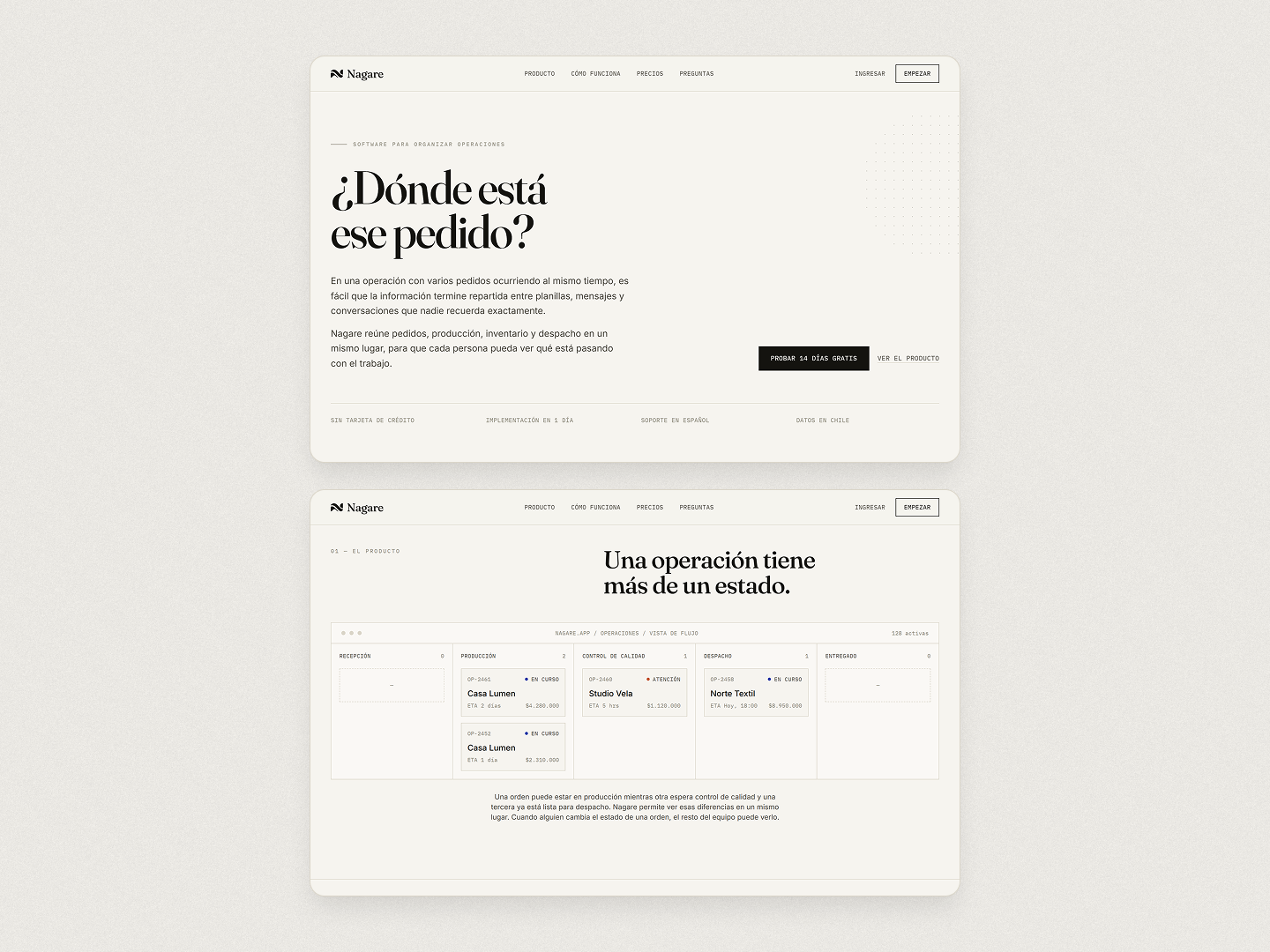
The opening establishes the problem first, then introduces the product through an actual interface rather than relying entirely on copy.
From there, the page gradually moves from the general idea of the product into more specific details.
//Letting the content flow
The name Nagare comes from 流れ, meaning flow.
That became a useful way to think about the structure of the page. A visitor should be able to keep scrolling because the previous section has given them a reason to wonder about the next one.
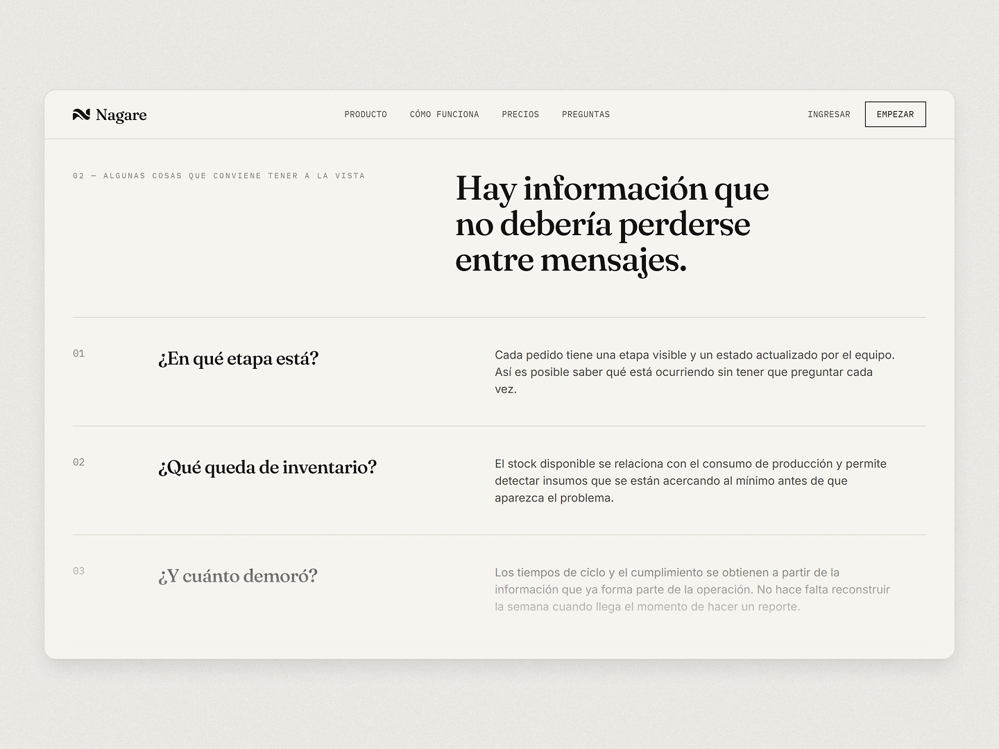
The feature section is built around questions rather than a collection of generic marketing statements. Each one addresses a particular part of the product and gives the visitor a little more context before moving on.
I also wanted the interface to have enough visual variation to make a long page feel like a continuous experience rather than the same section repeated several times.
//Showing instead of claiming
There is a limit to how much a landing page can explain with words.
For an operations product, saying that it "helps organize your business" doesn't mean much on its own. Showing an order moving through different stages, or a dashboard containing actual operational information, makes the idea considerably easier to understand.
The product UI therefore became part of the communication itself.
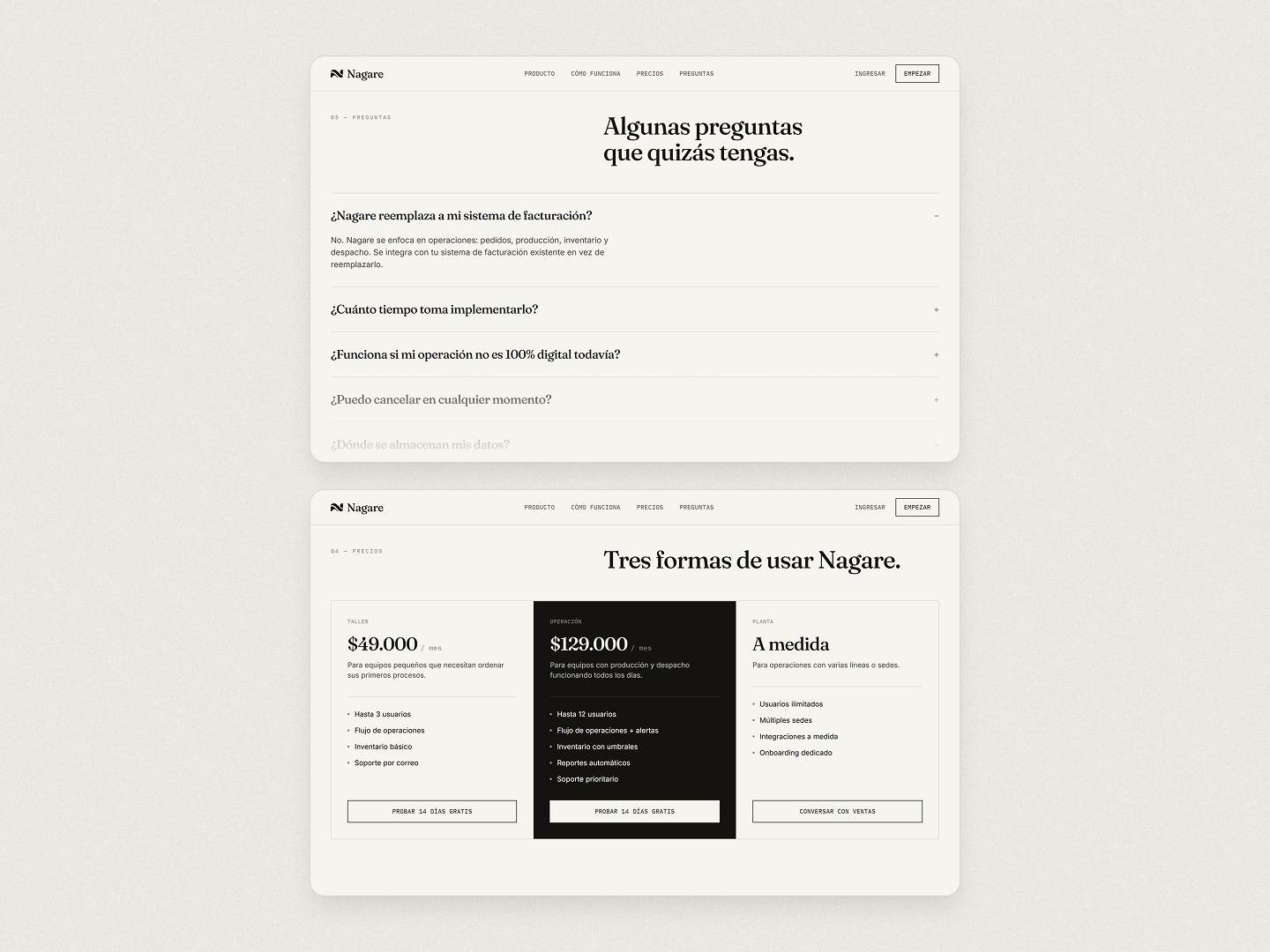
By the time the visitor reaches pricing and the FAQ, most of the basic questions should already have been answered. These sections deal with the practical concerns that remain before making a decision.
The final CTA is intentionally simple. At that point, there shouldn't be much left to explain.
//A landing page as a complete experience
Nagare was built as a showcase project inspired by the kind of product landing pages I worked on at Growth.
The SaaS is fictional, but the exercise is deliberately grounded in a realistic product so that the content, interface and information hierarchy have something concrete to work with.
Most of the work went into deciding what information belongs where, how much space each section needs and how to keep a long page interesting without relying on exaggerated marketing language.
The result is a landing page that tries to let the product speak for itself, while giving the visitor enough context to keep exploring.